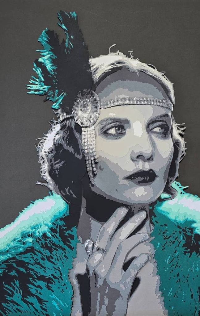
What inspired this piece?
This piece was a continuation of using black and white for the skin tone. Like ” Lady in Green” I chose this picture to one day create prints without having any copyright issues. However, I did this piece to now explore color and how it can play with the black and white flesh. I found the base photo at Pexels.com and this 1920’s style flapper by ‘Cottonbro studios’ really caught my eye as elegant yet classic. The original photo was in black and white, and while there was not much place to put some color, the fur coat and the feather in the diamond laced headband felt like the right spots for the color. I chose this teal color because I felt like it represented the art deco style of the 1920’s, not only that but teal is a rich, bold color, that again feels like it represents the roaring ’20’s well.
What did I hope to accomplish with this piece?
My hope with this piece was to continue with the theme of a black and white portrait with a one color theme for accent. The other goal of this piece was to continue the possibility of working on a non-copyrighted image for future print production. After working on this piece I really like the theme of using one color as a highlight and using black and white shades for the skin tones. Doing it this way saves some time, as it it easier to find the right tones of one color then it is to find the correct shades to accurately depict the right skin tone. After doing this piece I decided I was going to do one more with this color theme to make it into a series.
 Art by Seth Michael
Leave a comment