What inspired this piece?
This was my second piece I created after my 10 year hiatus in art. During this time I was reading on how to start selling my art, and one of the biggest points that stood out for me was that artists make their money on prints, not so much on originals. Up to this point all of my cut portraits were TV or Movie characters, which due to copyright laws, I would be unable to make them into prints. I decided that for this piece I would go find a reference photo from a royalty free site, and in this case I found pexels.com. This photo, taken by Behnam Khoramshahi, stood out to me and felt like a Renaissance painting, reminding me of the ‘Mona Lisa’.
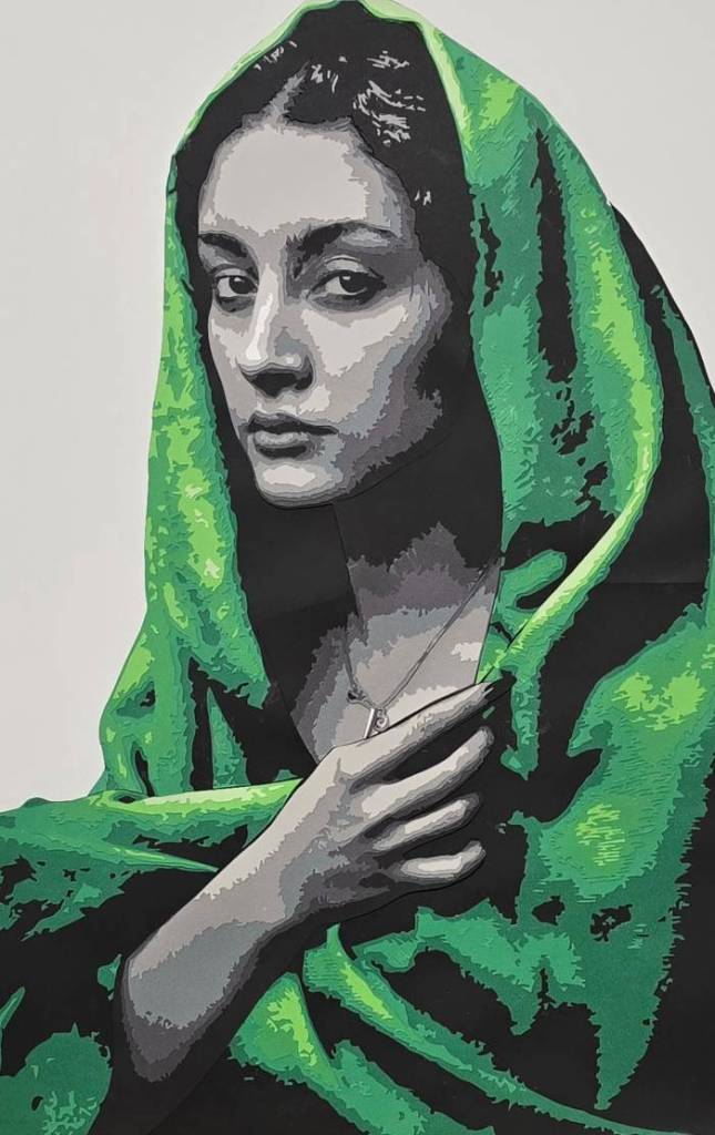
So Why the choice of green on black and white?
While I use 12×12 inch scrapbooking paper, at this point the only place I could get a reliable source with multiple colors, was either at Michaels, or Hobby Lobby. However, these craft places, had a limit to what colors they kept in stock. While I love doing these portraits, working on skin is always the biggest challenge, because finding five to eight different shades of skin color wasn’t working well at these craft stores. I could always find the mid shade of skin tone, but when I had to go darker or lighter from that color, it the skin tones became a little wonky. This is one of the reasons why some of my earlier cut portraits, like “Hawkeye” or “Jeanie” have an orange shades for their skin. I did get around this problem by doing a couple black and white pieces, and this original photo was a black and white photo. I was originally going to do this piece in black and white, and while I was out going to grab the paper, I saw this green, and there were plenty of different values that I thought would be good for a future project. As I got home, and started prepping for this piece, I had the thought of what if I were to use the green in this piece? It was an easy decision as to what park I would make green, seeing how there are only two parts to this piece: her skin, and the head scarf. I love this green paired with the black and white, it makes the green more vibrant, more lush. While using color wasn’t the original intent of this piece, it did add a bit more emotion in the end.
What did I hope to achieve with this piece?
So the original goal for this piece was to create something that was not a TV show or movie character/actor. In this process, I had discovered a way to “hide” the fact that skin tones are hard to get correctly in cardstock. While I wanted to create prints of this piece to sell, I have not quite gone through with that process because I do still have some reservations about turning these into prints. The way I create these portraits, i breakdown the figure into different sections. For example, the arm and hand is its own separate piece, the face, the neck, the head scarf, all its own separate pieces, and when they are all put together, with the thickness of the cardstock, it creates a depth to the piece that a photograph cant quite grasp.
I did submit this piece into a couple of art competitions, along with a couple other pieces I created after this piece, and I was honestly surprised at the results. This was the first time I had ever submitted a piece into any art competition, that was juried by fellow artists. “The Lady in Green” was a finalist for Teravarna for the 2026 LA Art Show, as well as featured in Visual Art Journal and was shown in Times Square in New York City. I would consider this piece the start of trying to make art something more than a hobby.

Leave a comment